Outlands Scribes Handbook
Scroll Layout
![]()
It's important to plan out your scroll, and the layout is the most important part of planning a scroll. If you take the time out before starting your scroll to figure out the entire layout plan, then the actual lettering and painting of the scroll will be the least-worrisome task --as you work you will know exactly how much space the text will occupy, how much space will be filled by illumination, how much margin space you'll have, etc. When you've completed the layout plan, you will know what the visual impact of the scroll will be, and can decide upon changes accordingly --is the border too thin or too thick? Does the illuminated initial need to be bigger? Is the scroll balanced overall?
The major elements of a typical SCA scrolls include:
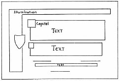
- The Text Block. This is the scroll text to be used for the piece including the names of the King and Queen, the correct name of the recipient, the date of the award- in short all of the writing.
- The Capital Initial. Often written as drawn Verbals, Roman Rustic, Uncial or Roman Square Capitals, these initials are found in decorated or historiated squares and written much larger than the rest of the text. They start the first word of the text and are often used to start the first word of each paragraph, the recipient's name and the names of the royalty.
- Border Illumination. This may be made up of Celtic knotwork or spiral and key patterns, bar and ivy motifs, Acanthus leaves or narrow illuminated panels.
- The Miniature. In late period pieces, this may be found covering most of the scroll with very little room for text. In earlier works, this was limited to a small picture inside the Capital Initial.
- The Heraldic Device/Achievement. For the purpose of SCA scrolls, a space for the heraldic device and achievement may be included if appropriate to the award. Before beginning work you should obtain the correct blazon and emblazon for the recipient's device. Refer to the "Achievements" section for more information.
Scroll Text Requirements
Scroll texts are very important. It indicates whether a scroll represents an official or unofficial act on the part of the Crown. An official act requires recognition of the award when the Scadian travels from kingdom to kingdom, regardless of whether that kingdom has a similar award. For example, someone who is a member of the Order of the Golden Ring cannot fight in a non-don tourney here in the Outlands. Outlands marshals are required to recognize it as equivalent to being a member of the White Scarf. No section can be left out in an official scroll text. The exact wording can be changed with permission from the kingdom scribe and the Crown or substituted from the appendix, but each section is absolutely necessary.
- Initial Greeting
- Identification of The Crown
- Identification of the Recipient
- Details of the Award
- Date of Award
- Signatures of the Crown
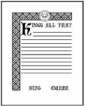
Example:
Grant of Arms:
(1) Unto all good people of the Known World
(2) _____ and _____ , King and Queen of the Outlands send Greetings.
(3) Whereas _____ has served Us and Our beloved lands for many long years {by [his/her/their] (deeds)} and has offered good and sage advice,
(4) We do create [him/her/them] a [Baron/Baroness] of Our Court and accord [His/Her/Their] Excellency [Baron/Baroness] _____ the acclaim and praise of which [he/she/they] is so worthy. {We hereby affirm [his/her/their] right to bear the following Arms: (BLAZON), previously approved by the College of Arms.} This day, We return unto [him/her/them] a portion of the great honour which [his/her/their] works have brought to [his/her/their] Barony of _____ and the Outlands.
(5) In witness whereof, We set Our hands this _____ day of _____, in the _____ year of the Society, being _____ Gregorian.
__________
King
__________
Queen
Important Notes:
- Text in brackets {text} are optional and can be left out if needed.
- If you leave out the blazon (description) of the award badge or insignia, you MUST include the badge/insignia in your illumination.
Determining the Amount of Space for the Text Block
Take a good look at the text of the scroll. Usually, most of the text will be lettered in one size, with perhaps the leading line, or some significant phrase in the middle, written in a larger text size for accent (There's nothing wrong with doing the entire text in one size, using color for accent. In most medieval manuscripts, letters were enlarged only at the very start of the page and the text stayed uniform throughout the rest of the writing, outside of a sprinkling of enlarged initial capitals.) One important thing that can help with this is to keep photocopies or photographs of completed work. They can help in estimating your size requirements for a scroll using a similar hand.
Method 1: The Graph Paper Approach
Select the nib size(s) that you want to letter the scroll in. Find one kind of graph paper spaced in a manner that allows you to use the printed lines as lettering guidelines as lettering guide-lines for all your letter sizes (if you're having trouble finding other than 4-squares-to-the-inch paper, try a college bookstore, an office supply store, or a drafting supply shop). Alternately, you can rule the guidelines with a ruler and pencil or an Ames Lettering Guide (see segment later in this section for more information on using an Ames Lettering Guide). These will give you flexibility in matching your line spacing to you pen width. Generally, the smaller the paper you have to work with, the smaller the nib width you will choose.
Now it's time for a little trial and error. Pick a width for your text block, say 6 inches; pencil the boundaries accordingly on the graph paper, and letter the entire text of the scroll in sizes which it will appear in the final version. Make sure you stay as close within the margin boundaries as you can (never go more than one letter past the margin line -- if there's still space at the end of the line, but the next word won't fit, leave the space and start the next line. The space can later be filled with a bit of illumination). Don't bother changing ink colors here; it's just the size we're concerned with. Any different-sized ornamental capitals within the text should be penciled in as you go along. If there will be some feature in the scroll that prevents the text from being in a nice, neat, rectangular block (i.e., you need to write around a heraldic achievement, or a huge initial capital, or some extension of the illumination that spreads into the upper right corner of the text, etc.), then pencil in the approximate shape of the think you have to letter around, and write around it accordingly.
When you're finished with the text, allow space for royalty to sign their names, and write "King" and "Queen" (or whatever alternate titles the Crown may be using) at the bottom. If the text requires, include the Herald's Confirmation of Arms and the signature space for the White Stag Principal Herald. Note: don't worry about messing up when you're writing all this text. Just write the corrections right over your mistakes as though they weren't there; you're trying to determine how much space the text will take up, and mistakes don't matter here. Now take a good objective look at the shape of the text block. Is it what you wanted? Usually on the first try, it's not. Decide what changes need to be made (extend or reduce margins, change text size, modify intruding illumination), get another piece of graph paper and write out the text again. This can be the most tedious part of doing the scroll (especially if you're doing a big scroll with lots of text and intruding illumination!). Once it's right on graph paper, then the scribe can mark off the text area on the parchment, draw the guidelines (using the graph paper instead of a ruler as a guide, even) and letter in the scroll text on the parchment without having to worry at all about whether it will fit or not. You will find that the less worrying you're doing while you're lettering, the less inclined you'll be to make mistakes.
Method 2: The mathematical approach
Another method for determining the amount of space you need for the text block, is to use a calculator and a sample of the hand you want to use, done with the same nib size as you intend to use on your new scroll (one reason that actual size photocopies of your scrolls are a good idea!). Count the number of letters in the scroll text you will be using, including all the names and dates (you can type the text into a word processing program and do a "word count" if you like). Then figure out how many letters per inch you get with a particular hand and nib size. To do this, take your sample of this hand, and count the number of letters on a typical line of text (don't worry about spaces), and divide the number of letters by the width of the line in inches. This gets you your letters per inch figure. This number represents the average number of letters that you can fit into a 1 inch line using that particular hand and nib size. For a more accurate figure, you can average the results from several different lines of text, rather than counting only one line.
Once you know how many letters per inch you get using that hand and nib size, divide the total number of letters in your new scroll text by the number of letters per inch. This should give you the number of inches that your text will take up if written in one long line. Now divide this figure by the desired width of the new text block. This will tell you the number of lines you will need to fit your text (i.e. if your text is such that you need 120 inches to write it, and you want a 6 inch wide text block, then you will need 20 lines of text.) Now using your original example of this hand, you can measure how much space it will take to fit that many lines of text. This should provide you with both your text block height and width. With this method, it is easy to forget to leave space for the signature lines for the Crown and White Stag, so be sure to allow plenty of room for them.
Other Methods for Determining the Text Block Size
There are other methods which professional calligraphers use as well. Some will write out their text to determine the space it takes, and then reduce it on a photocopier to the size they desire that matches a pen nib width they have (an advantage of cutting your own quills!). This reduced layout can then be used as a master for lettering the final piece. This is done by using a light table and lettering over the reduced layout. Some scribes take a broad-edged pencil (a carpenter's pencil) and trim it to the size they want. They then do the text layout in pencil and make changes with an eraser.
When it is the way they want it, they trace it onto the final piece. With the availability of so many calligraphic computer fonts, many scribes do a scroll layout on the computer, and then use that as the master, and trace over the letters using a light table. There are several caveats if you choose to use this method. First of all, please use a computer font that matches an historic hand used in period calligraphy. Many computer fonts may be calligraphic in nature, but not all of them resemble period hands. Another problem seen with using a computer for your layout is that often the computer will allow too much space between letters, or lines of text. Most medieval hands have the letters just touching each other, or very nearly, and computer fonts generally have the letters spaced farther than this. This gives the text a non-period look. Using a good illustration or page layout program will enable you to control how tightly spaced the letters are. The controls needed to adjust this are tracking and kerning. In order to adjust the spacing between lines to more closely match your period example, you will need to use the leading controls. While using the computer to make a layout and tracing over it can be a time-saver (and can be especially useful for lefthanders), it is better to rule your paper and letter it free-hand, just as medieval scribes would have done. Then you are not constrained by what fonts you have available for your computer, and will not have to worry about your scroll looking wrong because of problems with letter and line spacing.
Adjusting the Text Length to Fit
Since we are all human, and the consistency of our lettering may vary from one day to the next, sometimes you will find that despite your planning, you will be taking up more or less space with your text than you had originally planned for. If you are nearing the end of the text, and have been writing smaller than you initially estimated, you will have a big gap at the bottom of your text block that may well look unbalanced. Contrariwise, if you have been taking up a bit more space with your letters than you thought, you could be running out of room to fit the end of your text. A good trick for handling either problem is to adjust the final line of the scroll text. This is the line that usually reads something like "Done by Our hands this fourth day of January, Anno Societatis xxxviii, being 2004 of the common era." If you need to take up more space, then it is easy to make that line longer by changing it, using some of the phrases in the Mix-and-Match section. You could change it to "In testimony whereof We have set our Royal signs manual, at the feast of Twelfth Night in Our Barony of Caerthe on this fourth day of January, Anno Societatis thirty-eight, being two thousand and four in the common reckoning of years." If you needed to compress the text somewhat, you could write "Done this iiii day of January, AS xxxviii, being mmiiii Gregorian." Obviously this trick can only save you a given amount of space, so do try to plan ahead as well as you can so that you start with an appropriate sized text block to begin with.
Determine the Illumination Space
This is a far easier and more flexible process than doing the text. Presuming that you already have an idea of what the illumination will consist of (such as knotwork, thin stripes with leaves sprouting from them, etc.) and where it will be (an enclosed border; a strip down the side; two strips at top and bottom; an archway on three sides, etc.), sketch roughly the components of the illumination in the size you intend to paint them in, then measure them.
Figuring out entire decorated area and margins
On another piece of graph paper (the smaller the squares the better) draw a scaled- down sketch of the scroll, blocking out the area the text will be placed (make sure you figure in at least 1/2 inch between the text margins and the illumination). Actually creating the scaled-down sketch reduces the chances for error by just cumulatively adding measurements and jotting them down somewhere. Also, you can quickly determine the measurements that need to be marked on the paper from an accurately scaled-down sketch.
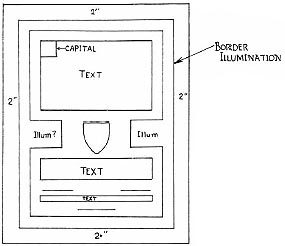
Look at the completed sketch and add sufficient space for margins around the illumination. Don't skimp --chances are the recipient might want to mat and/or frame the piece, and it's extremely difficult to do so if the design runs nearly to the edge of the paper (margins should be no less than one inch, and ideally 2 to 3 inches for larger scrolls.). Also, if your margins look too big on the finished scroll, the recipient can always cut them down a little.
You will realize that only at this point of your planning do you now have a true idea as to how big the scroll is going to be. Surprised? Scrolls always end up bigger than originally estimated. By going through this laborious layout process, you save yourself the trouble of drawing guidelines on a piece of paper you were sure would be big enough, lettering all of the text, and then realizing with disappointment that you have only 1/4 of the space you'd hoped to have for the elaborate illumination you had in mind, and that still doesn't leave enough margin space for easy matting. The work that goes into careful layout and planning is worth it.
Standard Frame Sizes
Because framing an unusual sized piece of artwork can be quite expensive, it is courteous of you to make your scroll in one of the standard frame sizes. Precut mats, and ready-made frames are available in certain standard sizes at a reasonable price. It is to your benefit as well, if you want to see the scroll that you have labored over be taken care of properly. If you make scrolls that are very large, or of an unusual size, the recipient may be unable to frame the scroll, and wind up storing it in a closet rather than displaying it proudly on the wall. Below is a list of standard and available frame sizes, measured in inches. The second category includes sizes that may be more difficult to find, or more expensive.
|
Standard Frame
Sizes
|
Other Available
Sizes
|
Drawing the Guidelines and the Ames Lettering Guide
Now that you've completed the layout plan and know how large the scroll will be (including margins), take a piece of paper slightly larger than your calculated scroll size and lightly pencil in the boundaries for the text and illumination areas as determined on your scaled-down sketch. NOTE: If you're not sure what side of the paper is the front, then take a scrap piece and write a line of text on it with the pen and inks you intend to use on the final scroll --on some papers, ink will bleed more on the back side. Then, using a ruler (or the graph paper you lettered the text on), mark and draw the guidelines for the text. Perhaps a better alternative is to use an Ames Lettering Guide. These inexpensive plastic tools are designed so that you can easily make parallel lines very precise distances apart. They can be found at most art supply stores, and often at hobby stores.

To use an Ames lettering guide, you will need a T-square, and a square or rectangular table. Tape your scroll to the table, with the sides parallel to the edges. Measure and draw lines outlining your margins, illuminated areas, and text block. Set the Ames lettering guide by determining how far apart you need your lines to be (this will depend on nib size, and the x-height of the hand you plan to use). Different brands of guides have different markings, so follow the directions that come with the guide. Some guides have a separate set of marks to use for metric sizes (useful for many brands of nibs, which are also metric). Once you have set your guide by turning the center wheel to the correct setting, set the guide on the top edge of the T-square, and slide the T-square up or down until you can line up the top lettering guide hole (in the row you are using) with the top edge of your text block. Rule the first line by putting your pencil at the bottom edge of the next hole down, and lightly pulling the lettering guide across the paper. Move down one hole, and pull back the other direction to make another line. When you run out of holes, move your T-square down until the top row in the guide lines up with the last line you drew. Continue ruling the paper. This goes surprisingly fast, and is the best method for producing consistent guidelines. Remember to always put your pencil at the bottom edge of each hole, so that your lines are evenly spaced. Likewise, when lining up the guide with a previous line, make sure the line is along the bottom edge of the hole. It's a lot easier to actually use an Ames lettering guide than it is to explain it, so don't despair!
Once you've finished ruling your text block, lightly sketch any drawn initial letters, and lines of text consisting entirely of drawn letters. Finally, sketch in as much of your illumination design as you want, making slight changes if need be. When drawing in design elements, don't forget to leave room for any text near them, it's easy to forget to leave enough space for the ascenders and descenders.
Lettering the Text
Before putting your pen to the paper, you should warm up by writing several lines of the text on a piece of scrap paper to get the feel of the pen on the paper. Beware of the "ink blob" --right after dipping, the pen usually contains excessive ink which will fall onto the paper as soon as it touches it (it's a better practice to apply ink to the pen carefully with an eyedropper). Keep a piece of scrap paper handy on which to write a few squiggles on to remove the excess ink before lettering on the paper. It is also highly recommended that you keep a sheet of clean paper under your hand to keep it off the paper you're writing on. The oils and moisture from your hand can affect the way the paper accepts inks and paints. Some scribes even make a cover sheet that covers the entire scroll except for the area that they are working on.
When ready, go ahead and letter the text, using the previously lettered version on graph paper (if you made one), or printed copy of the text including all of the correct dates and names, as your guide. If a line of the text on your graph paper version extends a little over the margin, then scrunch up your lettering a little to compensate. Don't be afraid to hyphenate words when necessary. It looks better to use some hyphenation than to scrunch your lettering up too much. In some early period hands it was typical to just break off wherever you happened to be when you came to the right margin, it makes for a nicely right-justified text block, but results in some odd breaks in the words!
When you get to capitals that will be illuminated, pause and pencil them in as you reach them. Be conscientious, but don't worry about making mistakes --the more stressed you are, the more likely you are to mess up. If you get tired or bored, get up and take a break before your lettering gets sloppy. If you make a mistake, don't despair. If you started to write the wrong word and caught yourself after only a few letters, try lettering the correct word over the one you mistakenly started to write (ignore the incorrect letters as much as possible, just letter right over them). Once it has been given at least an hour to dry, follow the directions below for scraping away the parts that you don't want. If you don't catch your mistake right away, you can either just keep going, and when you're done, read the section on "Correcting Mistakes", or accept the fact, get a new piece of paper, re-sketch the layout, and start over. It's not the end of the world. When the text is complete, wait at least an hour or two for all of the ink to dry before proceeding to the illumination.
Correcting Lettering Mistakes
This is the section no one wants to read about. After all, with all these permanent inks, permanent paints, etc., does that mean you end up with permanent mistakes? One would hope not! For lettering errors, nothing beats the method of the medieval scribe -- carefully scrape the ink off (after it dries thoroughly, that is) with an extremely sharp knife. If you look at a lot of medieval illustrations of monks in scriptoriums, you'll notice that they are leaning over their parchment, quill in one hand, knife in the other. In fact, today's pocket knives used to be called pen-knives, but that name died out quickly after we switched from quills and inkwells to the ubiquitous ball-point pen. In this day and age, "extremely sharp knife" means an X-acto knife or razor blade. Be careful not to cut the paper -- you should be scraping, not cutting. All you are trying to do is scrape the thin layer of ink-impregnated paper off the parchment. Some calligraphers suggest going over the scraped area with a vinyl eraser to clean up the area, brushing away the eraser dust and then burnishing the area through a clean piece of paper to smooth the paper fibers back into the surface. The surface may be partially resized by pouncing with gum sandarac.
When all of the error is removed, letter the corrections in carefully, and with a pen that's not too ink saturated; the scraped paper has more of a tendency to absorb and bleed the newly applied ink. If you're afraid the corrected letter will come out too fuzzy, then try drawing the letter in with an artists hard-tipped permanent black pen (like a micron Pigma or a Ceramicron technical pen). Another way to deal with a lettering error, especially if you know the scraped paper will bleed (and many do!), is to letter the correction over the incorrect letter, then, after everything dries thoroughly, scrape away the unwanted portions. This is made a bit easier if you gently make a shallow cut around the correct letter, then scrape away the unwanted portions with your X-acto knife. Use a soft white eraser to clean up (the click-erasers sold in most office supply stores are just right for this). And if you like, burnish the surface of the paper back down using a burnisher or bone folder through a protective layer of smooth paper (such as glassine, the paper that stamps come wrapped in).
The most serious error is leaving out text in the main body of lettering. If it's just a word or short phrase, and the meaning of the text is not altered significantly (for example, writing "King and Queen of the Outlands" instead of "King and Queen of these fair Outlands") then check with the Kingdom Scribe or whoever's giving the award to determine if the omission really matters. Most text omissions, however, do not fall in this nice, neat category, and the scroll will have to be rewritten. For this case, prevention is the best cure. Do your lettering with the correct text in front of you and refer to it frequently. Don't start illuminating without checking your text thoroughly to see that it matches what it's supposed to say --it doesn't take as long to re-letter a piece of parchment as it does to do an entire scroll over. On the same note, carefully check all names that will appear in the scroll to see if they're spelled correctly. Don't just trust your instincts. Everyone gets annoyed when their name gets spelled wrong on something that they'd hoped to display in their home. The White Stag Herald is the final source of correct name spellings.
Illuminating the Scroll
Once the text is written and double-checked for any errors (make sure there are not omitted words or phrases), you are ready to do the illumination. Illumination should always be done after the lettering, not before; text errors are easier to make (and harder to fix) than painting errors, and you'll be wanting to kill yourself if you mess up the text after spending a week painting a very elaborate border.
If you are using gold leaf, it should be done before the paint is applied; gold leaf adheres to the gums that are used as binders in paints. Don't be afraid to use drawing tools such as a compass, French curve, or circle template to help you with your illumination. We know that they used a variety of tools in period, and in many manuscripts, there are holes in the pages from where a compass was used. If the Book of Kells can have compass holes in its pages (and it does), then so can your scroll!
Illuminating the scroll is the fun part of scribing --here you get to see your design ideas come to fruition, and you may be rather pleasantly surprised at what you can do. In a lot of 11th-13th century medieval illumination, you'll notice that the artist usually accented certain components of the design, such as leaves, geometric figures, scrollwork, etc., by painting them in progressively lighter shades, ending in white detail. Try the following method to duplicate this kind of decoration:
- Paint the shape (leaf, geometric figure, etc.) with a dark shade of the color you intend the shape to be.
- Decide whether you want to shade the object lighter to the outside or inside.
- On your palette, mix a little white with the first color. Paint over the figure, leaving a visible amount of the first shade wherever it's supposed to be darkest (i.e., if your leaf is to shade lighter towards the edge, then paint a broad band around the edge, leaving a dark, vaguely leafed shape of the first color in the center).
- Again on the palette, mix more white with the first lighter shade (you're making progressively lighter shades.). Paint again over the last color, leaving enough of it visible.
- Mix yet another lighter shade of the base color, and paint it over the last color, leaving a band of the last color visible. Keep repeating this step until you're just about at pure white, or run out of room. The number of progressively paler shades can very considerable, depending on whether you're working on an exquisitely fine level (6 or more shades between the base color and white) or on a crude level (2 shades between the base color and white.) Both levels can be found in medieval illumination.
- For the final touch, line the very edge of the palest shade with pure white (if you've shaded into the interior, then put a significant line or dot of white in the center.) Decorate the shaded interior (the dark part) with lines of fine white dots, if desired.
Shading does wonders for making a simple, repeating design look beautiful. The method outlined above should be simple enough for most non-professional artists, who can't blend paint neatly, to handle. And it's a very period style; in medieval manuscripts using this technique, the divisions between one shade and another are very distinct and are not blended together.
Correcting Illumination Errors
Illumination errors are much easier to take care of. If the mistake is in an area that is completely painted, and you're using opaque paints, then just paint it over. If you're using transparent inks, try mixing the correct color with a little opaque white ink or white watercolor pigment (China white), and then paint over the mistake.
If, by misfortune, the error is in an area that wasn't meant to be painted (like, the paintbrush slipped out of your hand and left a sepia-brown blotch 3/4 inch to the left of the border (yes, this has happened!) then try to incorporate it into the design. Turn an errant line into a branch covered with little gold leaves, or cover a blotch with a knot- entwined rope adventuring from the main pattern, etc.
One of the things that is just fascinating about medieval illumination is all the little random elements that stick out of the main borders. Trying to duplicate that kind of style is highly difficult. (How can you plan something that's random?). Many of those types of ornaments may not have been in the original design plan, but might have been added on a whim, or maybe to correct an error.
The Finished Scroll
The text is lettered, the designs are all painted, the corrections have been made, the gold is filled in and outlined, the very last little tiny dots of white in the decorated capitals have been carefully and lovingly applied, and the excess paper around the edge, if any, has been trimmed to aesthetically perfect margins. The scroll is finished, and you're just bursting with pride over your work. Well, now what?
Sign Your Work
Always make sure you remember to sign your work. After all, you'll want people to know who did the scroll. After all those hours of work, your modesty and humbleness notwithstanding, you do deserve some recognition. Even if you truly don't want any recognition, it is common courtesy to let the recipient of the scroll know who made it for them. If you wish to remain anonymous in Court, please give the Herald a note saying that the scribe wishes to remain anonymous. On the front of your work, discretely sign, mark, or initial the work (try making your mark look like it's an integral part of the design.) Maker's marks can consist of anything from an initial, to a stylized drawing. On the back, along the top left edge, sign your full SCA name (and mundane name, and date, and whatever strange and unusual interesting things you want to say about yourself, etc.). This is where the heralds look when they want to announce in court who made the scroll. Make sure your name is readable; don't necessarily sign it with a calligraphy pen.
A note about signing on the back: Over the years (depending on the paper, the ink, conditions, etc.), the ink used to sign the scroll may eventually creep through the paper and be visible from the front. Although this is a characteristic of medieval manuscripts today due to their great age; it is obviously not desirable on a new scroll. To minimize this occurrence, make sure you sign very close to the top edge where it would be hidden by a mat or the edge of a frame), or sign on the portion of the back which is covered by paint on the front. Signing with a pencil may be the best solution to this, as there is no chance of it bleeding through the paper.
Attach a typed copy of the scroll text
No matter how legible your calligraphy may be, it is difficult for heralds to read scrolls in the flickering light of a candle. To make their job a little easier, it is always polite to include a copy of the complete text of your scroll, including the names, recipient's blazon (if included) and date. Type it in a reasonably large font, so that it will be possible for the herald to read in less than optimal conditions, and attach it to the back of the scroll using a low-adhesive tape, such as Scotch Post-It tape (comes on a blue roll, look for it at office supply stores) or drafting tape (available at most art stores). This tape can be easily removed from the scroll with no damage to the paper, but will keep the herald's text from getting misplaced. Remember that the typed copy of the scroll text is confidential until after the award is given, and should be kept out of sight of those not involved with making or presenting the scroll.
Make a Copy
Now that you have signed it, and before you give it away, make some kind of copy of it. If you've got a camera, take it outside and have someone hold it while you take several pictures of it. Better yet, take it down to your local copier and get a color photocopy of it: the miracles of high-technology...an 11x17 color copy will cost around $1.50 to $2. Larger scrolls can be photocopied onto two 11x17" sheets. Even a black and white photocopy of a scroll is useful: being the exact size of the original, it tells you how big your text was, how complex your illumination turned out, and other useful things you might want to look back on. A copy of your scroll is a record of your achievements and failures in calligraphy and illumination. By studying it, you will know what things worked, and what mistakes shouldn't be repeated in your next project. Copies of your scrolls also make a useful portfolio of your work, and over the long term provide a record of your growth as a scribe.
Transporting Your Scroll
Once the scroll is completed and signed place the scroll in a flat scroll case. Enclosing the scroll between stiff boards such as foam-core works. You might, as a nice gesture, take the scroll to a framing shop and have it matted. A mat doesn't cost very much (around $6 for a 16x20 mat with an 11x14 opening), and it really makes your scroll look professional. Just make sure that if you're not going to frame the matted scroll as well, get a mat that is a standard frame size (refer to the list of standard frame sizes earlier in this section). Custom-framing a weird sized matted picture can be a bit expensive, and the recipient may not be in a financial position to afford it. Now you are responsible for getting the scroll to the event where it will be given. Remember that scrolls are confidential until their awards are given. Seal them and either take them yourself, mail them, or send them with someone who can be trusted. When in doubt, ask the Kingdom Scribe's advice as to how to get scrolls safely to an event.
A Final Note
If all this information seems to overwhelm you with complexity, don't despair of doing scrolls. Just start simple. A short piece of text, a single highlighted initial, and a simple repeating two or three color geometric border, should suffice for a first project. (There are lots of neat ones to be found in 13th century psalters.) As you pick up experience, the more complex projects will not look so difficult.
There are numerous ways to practice and sharpen your scribe skills before taking up kingdom scroll projects. Try volunteering to do prize scrolls for local events, letters from your shire/barony to royalty and others (includes invitations to events and recommendations for awards), or just do a decorative piece such as the lyrics of a song or a short section of a literary work. (There's nothing like lettering something in Latin, Old French, or Old English for achieving a real medieval appearance). Look at lots of examples of decorated medieval manuscripts, both the simple ones and the complex, and try to copy a feature of it, either text style or illumination. If the place where you live has a local mundane calligraphy club, you might want to become acquainted with other calligraphers to keep up-to-date on the latest materials.
And when you're ready, go ahead and volunteer to do an official scroll. The look on the face of the recipient of an award when he or she sees the beautiful scroll they've received in recognition of their work makes it all worth it.